Nio Help Center

Client

Nio

Role

UI/UX

Year

2025

Mobile app screen displaying loan management information on a dark blue interface. It shows a total contracted amount of R$ 10,000, payment progress with a green bar, and details of active loans categorized by purpose, such as renovation and transportation.
About

Help Center for Nio to centralize support and improve self-service with FAQs, tutorials, and troubleshooting guides.

See page

Challenge

The goal was to create a centralized Help Center that would give customers a fast and intuitive way to solve problems on their own. The experience needed to:

  • Content into a clear information hierarchy;
  • Make relevant support content easy to find in fewer clicks;
  • Reduce overload on support teams and chat channels;
  • Allow Nio to update content quickly without development effort.

In short: a self-service hub that improved customer autonomy and reduced friction.

My Role & Responsibilities

As the UI/UX Designer on the project, I was responsible for:

  • Structuring the Information Architecture;
  • Creating wireframes and prototypes in Figma;
  • Designing the UI for the full Help Center experience;
  • Supporting UX writing for clarity and consistency;
  • Collaborating with developers throughout implementation;
  • Running usability validations before launch;
  • Analyzing feedback and supporting post-launch improvements.

Process

  1. Information Architecture
    I categorized content into clear sections (e.g., plans, billing, equipment, installation) and structured user flows to shorten paths to answers.
  2. Wireframes & Prototyping
    I created low and mid-fidelity prototypes to validate navigation and layout decisions with the internal team.
  3. UI Design
    The final UI focused on clarity, scannability and consistency — reinforcing Nio’s visual identity while keeping support content easy to consume.
  4. Handoff & Collaboration
    I worked closely with developers, aligning interactions and behaviors to ensure a smooth implementation inside the Lumis platform.
  5. Testing & Iteration
    Before launch, I validated the flow with users and refined key screens based on usability feedback.
Mobile app screen of a digital bank with a blue and white interface. The screen displays the user's balance (R$ 240), options for financial transactions like Pix, deposits, and withdrawals, along with shortcuts for personal loans, a virtual card, and shopping promotions.
Mobile app screen displaying a list of loan installments on a blue and white interface. Each installment has a selection box that can be checked, while the total payment amount is displayed at the bottom of the screen along with a confirmation button.
Photo of a dark-skinned happy young man in a yellow shirt walking down the street, holding the phone, talking to his girlfriend, and smiling, looking cheerful.

The Solution

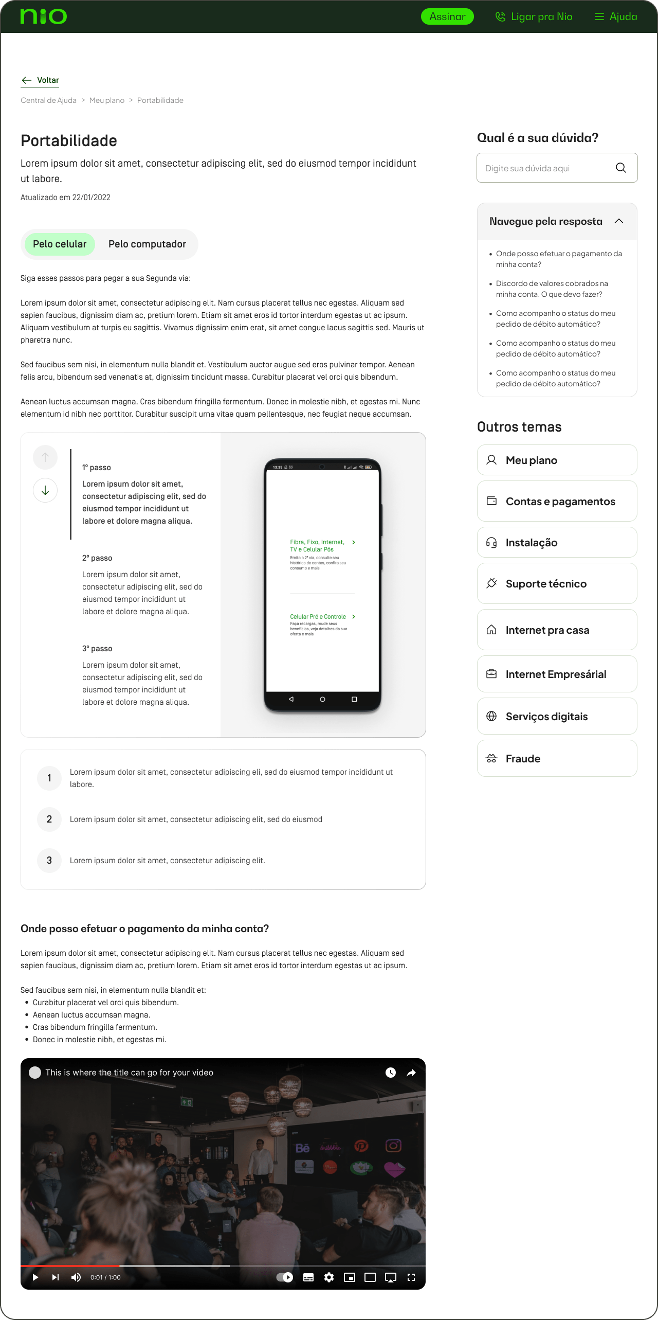
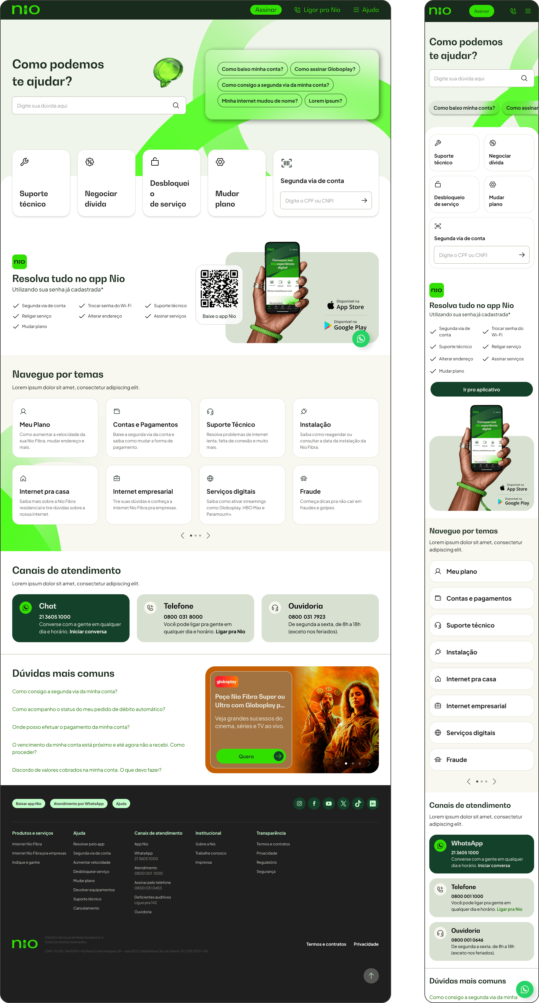
The final Help Center consolidated support content into a single, intuitive experience. With a smart navigation structure, searchable knowledge base and consistent layout across categories and articles, customers can now solve problems faster and with less frustration.

Thank You